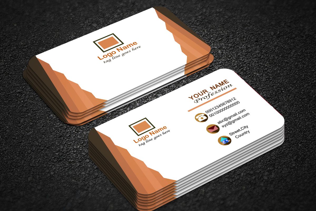
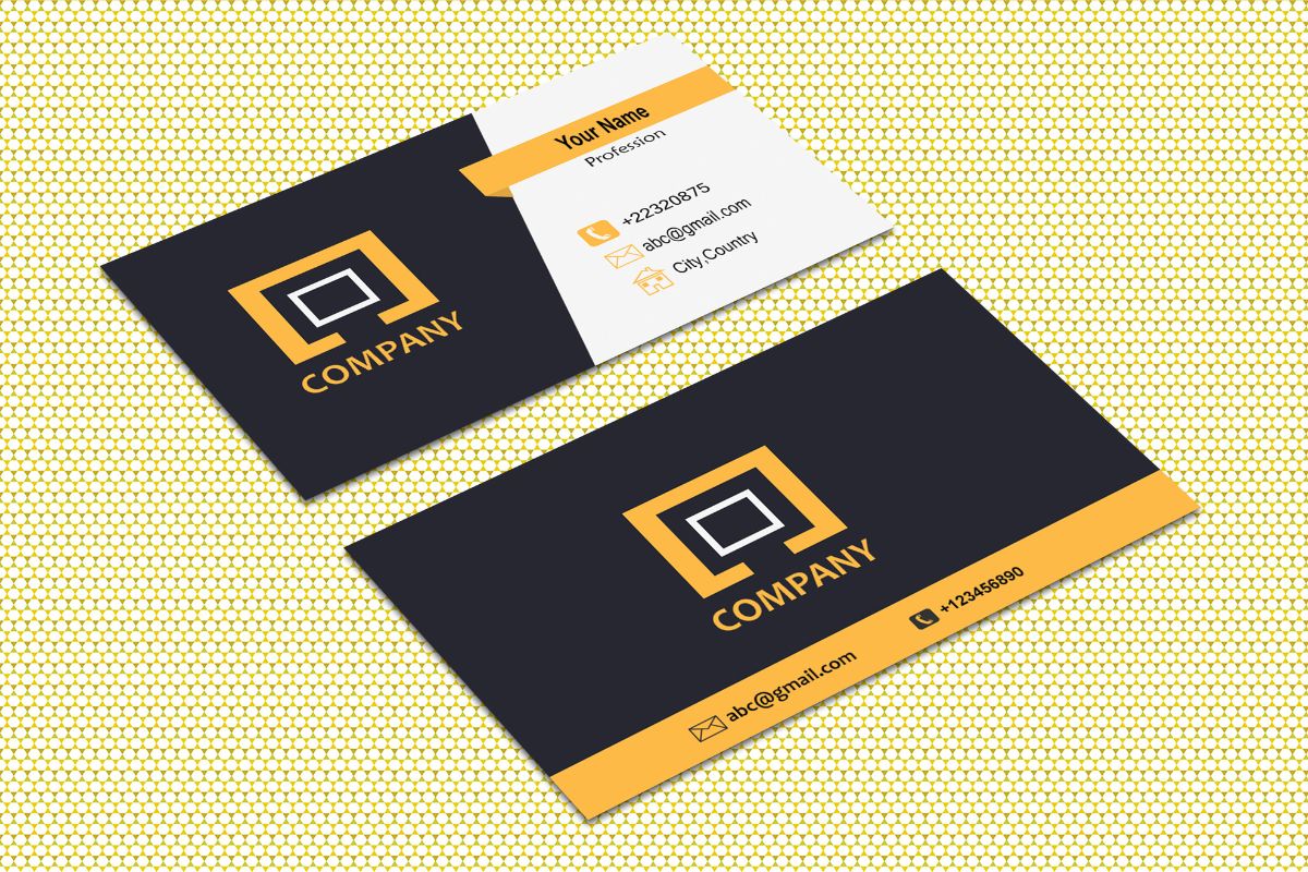
In the professional world, business cards are a staple of networking. They serve as a quick, portable method for sharing contact information and making a lasting impression. Selecting what to include on your business card is crucial; it can communicate your professionalism, brand identity, and the ease with which others can reach you.
Essential information such as your name, the company name, and preferred contact methods are the bedrock of any business card. Beyond these basics, consider adding a tagline that encapsulates your business ethos or a unique selling point to set yourself apart. With space at a premium, every choice should be deliberate, reflecting both your personality and the essence of your professional endeavors.
The design elements of your business card, including font choices, color schemes, and paper quality, can convey as much as the text. Opting for high-quality paper stock or including a QR code can enhance the tactile and visual impact of your card. Remember, a business card is not just a form of communication—it’s a piece of your brand that someone can take with them.
Essential Information
When designing your business card, there are key details that you must include to ensure it serves its purpose effectively. These details are your professional identity and the means through which potential contacts can reach out to you.
Name and Title
- Your Name: The most basic, yet most essential part of your business card. Make it bold and noticeable.
- Your Job Title: Immediately after your name, list your position to clarify your role in the company.
Company Name
- Company Name: Feature your company’s name prominently to establish brand recognition.
Contact Information
- Phone Number: A direct line to reach you.
- Email Address: A professional email that you check regularly.
- Physical Address: If applicable, the location of your office.
- Website: Including your company’s website is critical to guiding potential contacts to learn more about your business.
- Social Media: Choose one or two relevant social media platforms to include.
Branding Elements

In the landscape of business communication, your business card is a valuable tool that conveys your brand’s identity at a glance. Pay special attention to the integration of logos, color schemes, and taglines, as these are pivotal in establishing a strong brand presence.
Logo
Your logo is the visual cornerstone of your brand on your business card. Ensure that it is prominently placed and high-resolution. Choosing a design that’s both memorable and reflective of your business ethos will help in creating lasting impressions. For instance, a sleek and modern logo can communicate innovation, while a more classic design might convey tradition and reliability. Consider visiting 5 High-Performing Elements to Put on a Business Card for insights into effective logo placement.
Color Scheme
The color scheme on your business card should align with your brand’s overall design language. Consistency in colors aids in brand recognition and can evoke specific emotions tied to your business persona. A study on visual identity might suggest selecting no more than three main colors to maintain clarity and impact. Refer to How to design a business card: the ultimate guide for a deeper understanding of color theory in branding.
Tagline
Craft a concise and catchy tagline that encapsulates your brand’s mission or value proposition. This short statement is your chance to make a compelling argument for why potential contacts should engage with your business. The tagline should be readable at a glance, ideally placed near your logo to create a unified message. For inspiration on creating an impactful tagline, see What to Put On a Business Card: 8 Must-Have Elements.
Additional Details

When crafting your business card, it’s essential to include additional contact details to provide more avenues for connections. These details can elevate your branding and make it easier for clients or partners to find you online or in person.
Website URL
Your website is a digital gateway to your business, showcasing your work, services, or products. Ensure your website URL is clearly visible on the card. It should be concise and easy to remember to encourage visits.
Social Media Handles
In a world dominated by digital communication, providing your social media handles is non-negotiable. List your profiles like this:
- LinkedIn: @YourProfessionalHandle
- Twitter: @YourBusinessTwit
- Instagram: @YourBrandInsta
Align these with your brand identity and make sure they are updated regularly.
Physical Address
If your business relies on local clientele or in-person services, a physical address is crucial. The format should be simple and follow this structure:
Company Name
Street Address
City, State, Zip Code
Precision here guarantees that clients can physically find your business as easily as they can online.
Optional Features

When designing your business card, consider adding features that enhance functionality and convey professionalism. These options, although not mandatory, can set you apart in a competitive market.
QR Code
Embedding a QR code on your card can streamline how contacts access your information. A single scan could direct people to your professional profile, portfolio, or company website. This efficient technology saves space and adds a modern touch.
Certifications
If you have important industry certifications, displaying them can bolster your credibility. It shows your commitment to professional development and expertise in your field. List only relevant certifications, ensuring they’re current and recognized in your industry.
Design Considerations

When crafting your business card, the design elements you choose are crucial in conveying your brand’s message effectively. Pay close attention to font choices, material texture, and the overall layout.
Font Choices
Selecting the right font is pivotal to ensure readability and brand alignment. Serif fonts such as Times New Roman suggest formality and tradition, while sans-serif fonts like Arial speak to a modern, clean aesthetic. Use no more than two different fonts to maintain a cohesive look.
Material and Texture
Your choice of material adds a tactile dimension to your card. Options range from classic smooth cardstock to unique textured alternatives like linen or wood. Choosing a high-quality paper stock enhances durability and perceived value. For a distinctive feel, consider embossing or foil stamping to add texture.
Layout
The layout of your business card should balance white space with content, achieving an uncluttered design that directs attention to key details. Your name and contact information should be front and center, with your logo strategically placed for brand recognition. Ensure alignment and consistent margins for a professional appearance.
Frequently Asked Questions
In this section, you’ll find specific, actionable advice for creating professional and impactful business cards, tailoring them to different contexts, and avoiding common pitfalls.
What essential information should be included on a professional business card?
Your business card should contain your name, company position, company name, phone number, email address, and a physical or mailing address if relevant. It’s crucial to convey your professional identity clearly and provide easy ways for contacts to reach you.
How can a student effectively design a business card to make a lasting impression?
Students should focus on clean, uncluttered designs that include their name, education, contact information, and areas of expertise. Incorporating a personal logo or brand color scheme can help differentiate your card from others.
As a business owner, what unique elements can I feature on my business card?
Consider adding a slogan or value proposition, social media handles, and a QR code linking to your portfolio or website. For inspiration, browse examples of business cards that feature unique design elements tailored to their brand.
What are some common mistakes to avoid when designing a business card?
Avoid overcrowding your card with too much text or using hard-to-read fonts. Make sure to leave some white space for readability. Also, be wary of low-quality printing that could affect the professional look of your business card.
Can you provide examples of business cards with effective company messages?
An effective business card clearly showcases the company’s identity and mission. You might consider how a tagline or mission statement can reinforce your company message.
What are some creative strategies for making a business card memorable for networking purposes?
Use a distinctive shape, texture, or an interactive element like a fold-out design. Implementing a creative visual theme or using a tagline can make your card more memorable in networking scenarios.


