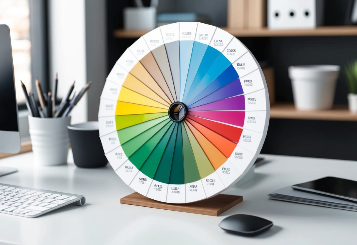
If you are interested in graphic design or printing, you’ve probably encountered an important term: PMS color.
PMS stands for Pantone Matching System, a universal color matching system used mainly in the printing industry.
Table of contents
The system assigns a unique code to each color, allowing designers and printers to ensure consistency across different media. This means that you can take a specific shade and have it look the same on business cards, brochures, and posters.
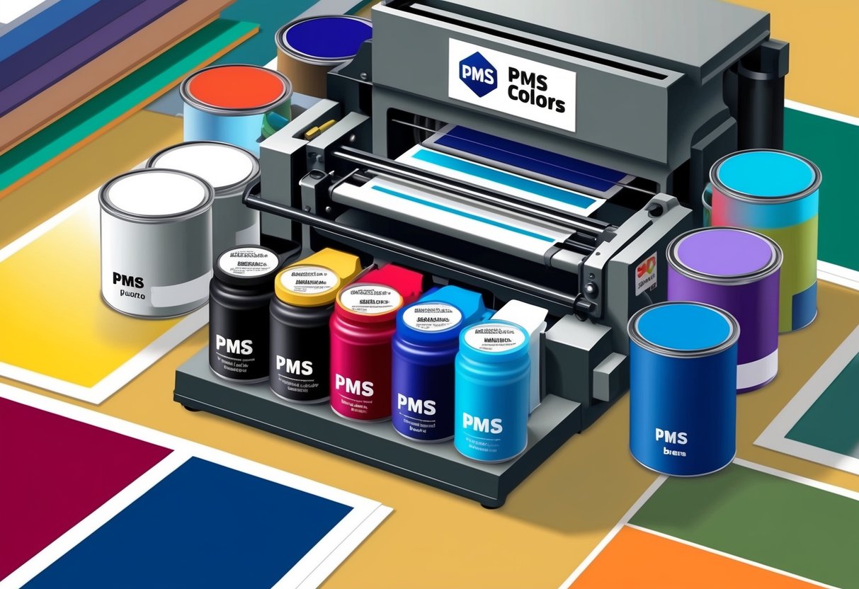
The beauty of the Pantone Matching System lies in its precision. Unlike the CMYK color model, PMS colors are pre-mixed before they are used for printing. This pre-mixing helps in achieving exact colors by minimizing any discrepancies.
Imagine trying to replicate the same color across multiple projects; PMS takes the guesswork out of this process, providing you with the exact shade every time.
Dive deeper into the world of PMS, and you’ll see it’s not just about colors but quality assurance for brands. Whether you’re inviting a vibrant splash of color in your designs or aiming for muted subtlety, PMS ensures your creative vision translates seamlessly from digital concepts to tangible print.
Understanding PMS

The Pantone Matching System (PMS) is essential for achieving standardized color reproduction and ensuring color accuracy. It plays a significant role in graphic design by allowing professionals to communicate precise color specifications.
History of the Pantone Matching System
The Pantone Matching System was developed in 1963 to address the need for consistent color reproduction. Before PMS, matching colors across different print jobs and locations was challenging. The system introduced a unique numbering system for colors, allowing for precise identification and matching.
Each color in the PMS is identified by a unique code, making it easy to reproduce consistent colors. This was a game-changer for industries that rely on color accuracy. Today, PMS remains a universal standard, benefiting designers, printers, and manufacturers worldwide.
Pantone’s Role in Graphic Design
In graphic design, PMS is invaluable for ensuring projects meet specific color standards. Designers use PMS to choose and communicate colors across various media, reducing discrepancies in the final product. This system helps achieve brand consistency, especially important for logos and branded materials.
PMS also facilitates spot color printing, providing colors that are more vibrant and accurate than those achieved through traditional process printing. By enabling precise color communication, the Pantone Matching System ensures that designers and printers can work together smoothly, achieving the intended visual outcomes without color mismatch issues.
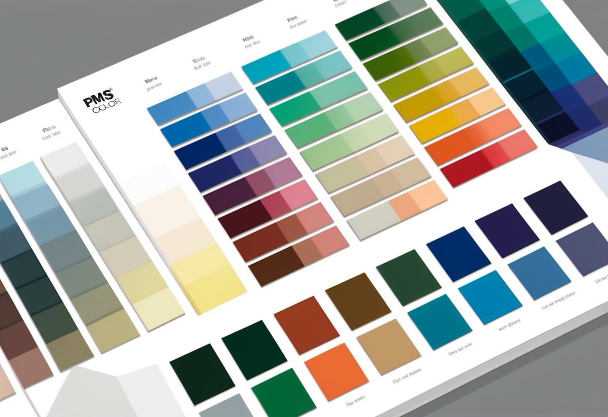
Components of the Pantone System
The Pantone system is a vital tool for designers, offering consistent reproduction of colors. Key elements include spot colors and color guides, which play crucial roles in maintaining color accuracy and communication.
Spot Colors Explained
Spot colors are a fundamental part of the Pantone system. These are pre-mixed ink colors used in printing, allowing for precise color matching. Unlike CMYK, which mixes four standard inks, spot colors come in specific shades that can be applied without blending.
You might choose spot colors to achieve a vibrant or consistent tone that CMYK can’t match. They are often used for branding, ensuring that logos and corporate materials maintain their color integrity across various formats.
Solid colors are a type of spot color. These are single colors printed using pure ink. This eliminates errors that might come from mixing multiple inks.
Pantone provides thousands of spot colors, which designers can access for print projects or branded materials. This system is invaluable when precise color communication and reproduction are necessary.
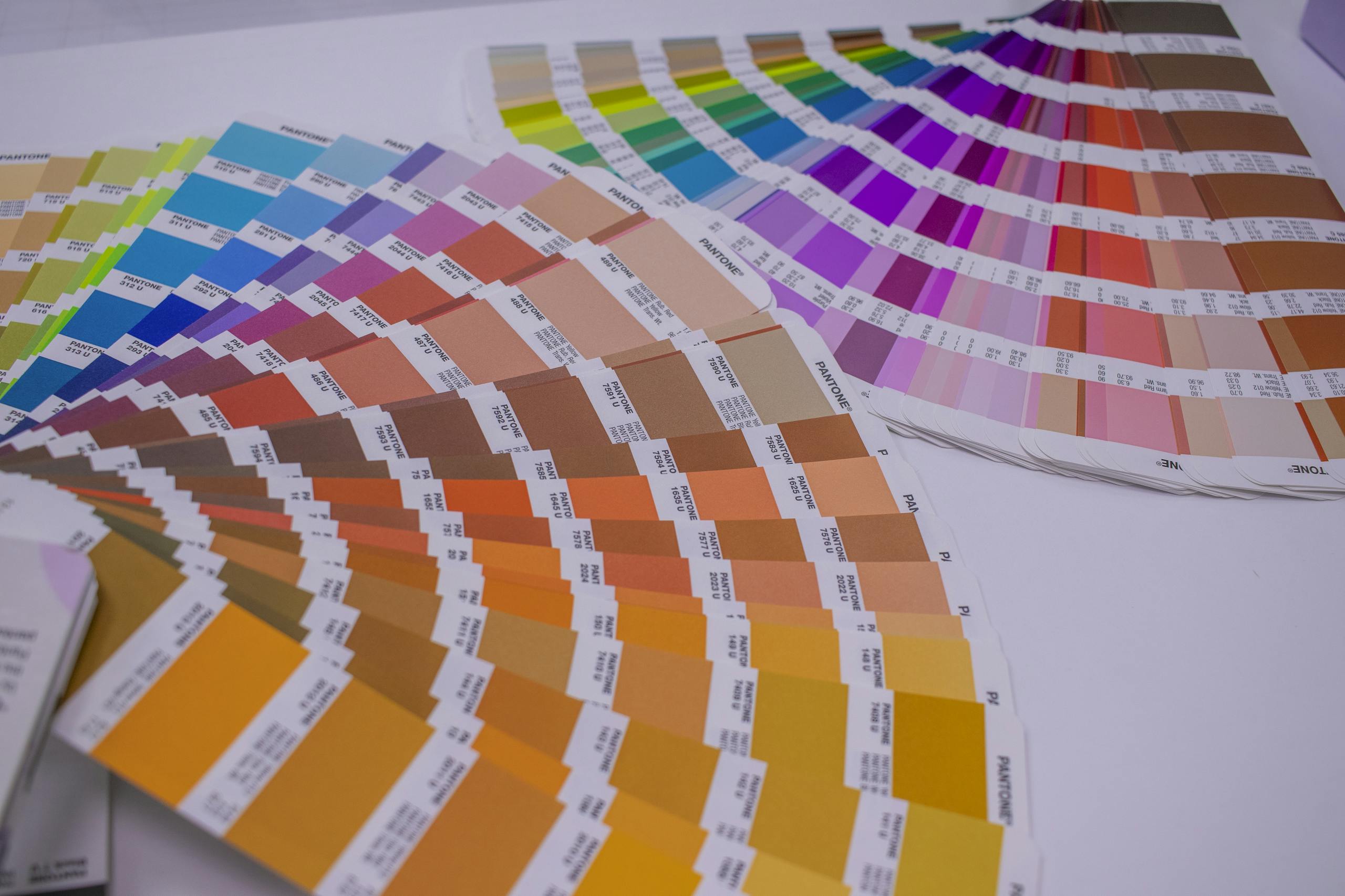
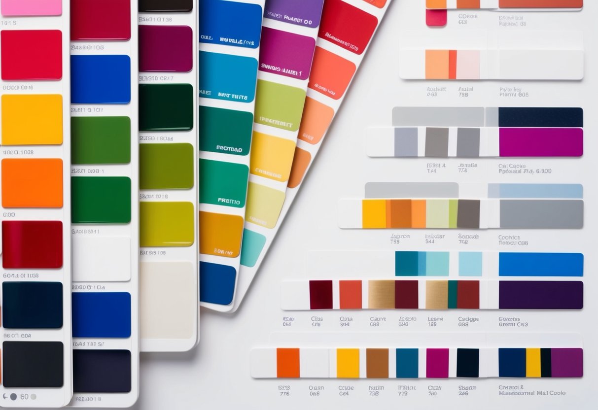
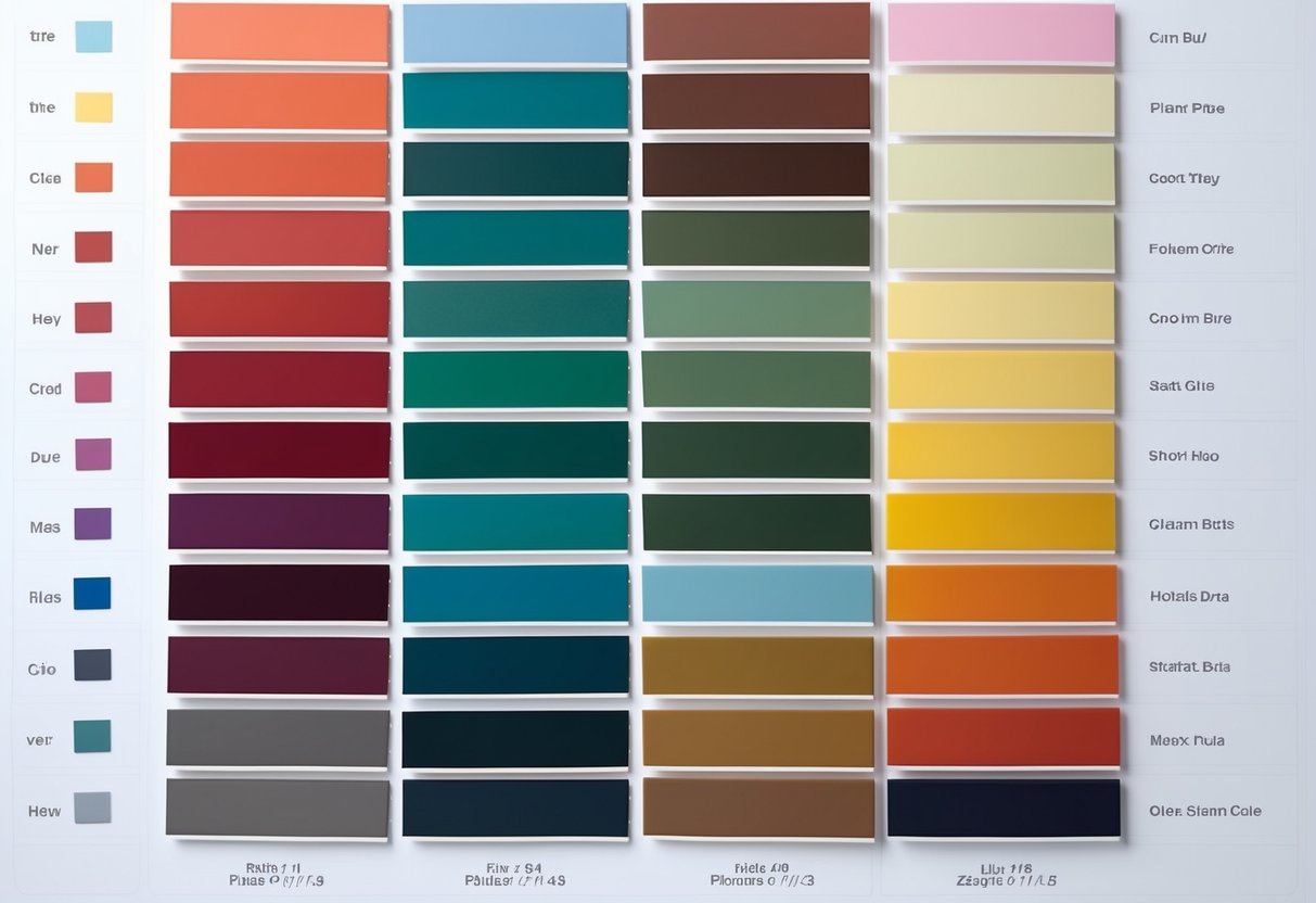
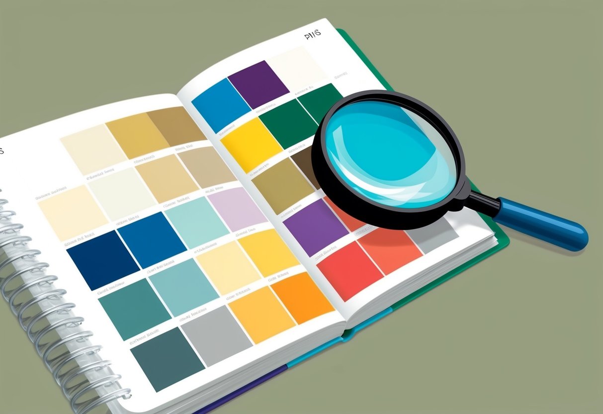
Pantone Color Guides and Collections
Pantone Color Guides are essential tools for designers and printers. These guides contain thousands of colors, each with a unique identifying number. They allow users to select and reference exact colors necessary for their projects. These guides ensure that everyone involved in the production process is on the same page regarding color choices.
Pantone Color Collections include various palettes like the Fashion, Home + Interiors system, which offers shades tailored for textiles and furnishings. Designers across different industries rely on these collections to find the right colors for specific applications.
Each guide is organized carefully, making it easy to navigate through racks of color chips or swatches. By using Pantone guides, you ensure your designs maintain color consistency from design to final product.
Key Applications of PMS
The Pantone Matching System (PMS) is widely used in branding, packaging, and fashion due to its ability to ensure color accuracy. Across industries, PMS helps maintain consistent visual identities and product appearances.
Branding and Corporate Identity
PMS colors are crucial in creating a recognizable and consistent brand image. By using specific PMS codes, you ensure that your brand’s logo and materials always look the same, whether they’re on business cards or billboards. This consistency builds trust and familiarity with customers.
When designing corporate identities, you can precisely communicate desired colors to print shops and manufacturers. Iconic brands often use PMS to meet exact color needs across different promotional materials and platforms. This helps maintain brand integrity in any medium.
Packaging and Product Design
PMS colors are vital in packaging as they guarantee uniformity across materials and products. Imagine a cosmetic line where each product looks different due to mismatched colors—that’s where PMS helps by providing precise color matching.
For product design, using PMS ensures each item matches the design vision. Designers often rely on PMS when creating labels, boxes, and product wrappers. This system helps in meeting production requirements that demand specific color codes across various materials.
Fashion and Textiles
In fashion design, PMS colors allow designers to accurately translate their vision from a sketch to fabric. This is important for ensuring that the colors in clothing and accessories remain consistent as they transition from concept to finished product.
For textiles, PMS provides a way to achieve precise color matches in dyes and fabrics. It supports designers and manufacturers in managing large-scale productions with multiple color palettes, ensuring that fabric colors are consistent in each batch, reflecting the intended design aesthetics.
Printing and Reproduction
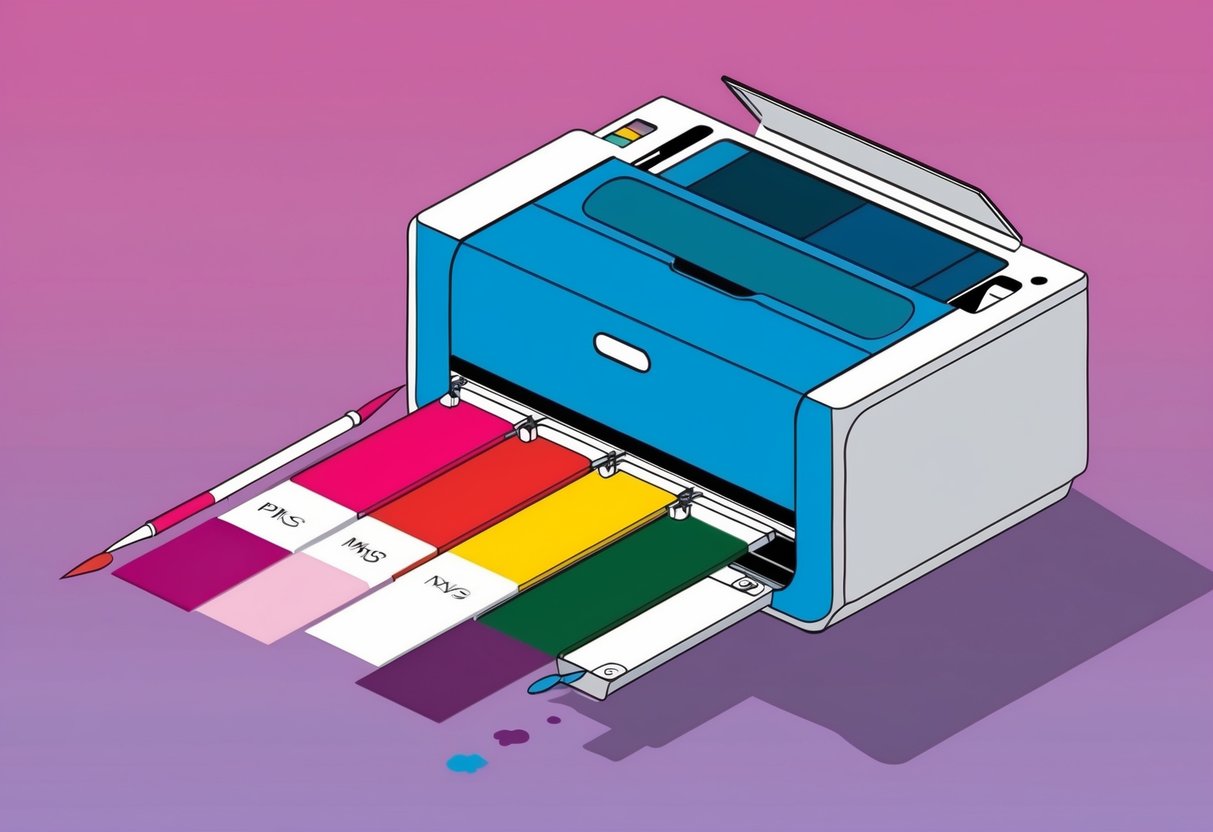
PMS colors play a crucial role in ensuring color consistency and accuracy in printing tasks. With methods like spot color printing, you can achieve vibrant results that match your design specifications perfectly.
The Printing Process with PMS
When you use the Pantone Matching System, you’re choosing a standard for color accuracy. PMS uses pre-mixed inks to create “spot colors,” which are applied directly to the printing material without the need for mixing during the process. This results in a more consistent and vibrant color finish.
Printing companies often prefer PMS for projects that require precise color matching. This is significant when printing logos or marketing materials where brand colors must be exact. Whether it’s on matte paper or another finish, PMS ensures that what you see in your designs is what you get in print.
Converting CMYK to Pantone
Converting from CMYK to Pantone involves more than just matching colors; it requires precise adjustments to maintain the intended look.
CMYK combines four ink colors (cyan, magenta, yellow, black) to create a range of hues, but it may lack the vibrancy and consistency of PMS.
When converting, you must choose Pantone equivalents that preserve the design’s integrity. This is vital in processes where RGB or HEX values might be more suitable for digital screens but fall short in print.
Using conversion tables or software is often necessary to achieve an accurate match. With the right tools, you can ensure that your prints maintain the quality and precision of color that PMS offers.
Color Systems Comparison
When selecting colors for projects, it is important to know the differences between various color systems. Pantone Matching System (PMS) is often compared with other color models like CMYK, RGB, and HEX in terms of color accuracy, reproduction, and application.
PMS vs. CMYK
The Pantone Matching System (PMS) offers precise color matching with unique codes for each shade. This system ensures consistent color reproduction across different materials. It’s popular in industries like printing where exact color matching is important.
CMYK stands for Cyan, Magenta, Yellow, and Black. It’s a subtractive color model used in printing. Colors are created by mixing these inks in various percentages. While CMYK is effective for full-color printing, it struggles with exact color matching, which is where PMS shines.
A key point to note is that while CMYK is ideal for projects requiring a wide range of colors, PMS provides consistency for brand colors and can replicate exact hues that CMYK might not achieve.
PMS vs. RGB and HEX
RGB is used for digital displays and stands for Red, Green, and Blue. It’s an additive model where colors are created by combining these primary colors in varying intensities. HEX is a shorthand version of RGB, often used in web design.
While PMS ensures exact color reproduction for print, RGB is tailored to screen applications where light creates the colors. Meanwhile, HEX codes offer a simple way to communicate RGB colors in digital formats.
PMS is essential when accurate color is crucial, such as in logos and branding, whereas RGB and HEX are optimized for digital use. Understanding these differences ensures clear communication and application across various platforms and media.
Industry Impact
The Pantone Matching System (PMS) plays an essential role in numerous fields, ensuring consistency and precision in color use. This section covers its influence in graphic design, fashion, and other industries.
Pantone in Modern Graphic Design
As a graphic designer, you rely on matching exact hues to bring your projects to life. The PMS allows you to achieve color consistency across various media. Pantone swatches provide a reference, ensuring colors appear the same regardless of the printer or material used.
In advertising, vibrant and specific Pantone colors catch attention quickly. Using consistent hues helps increase brand recognition and visibility. This uniformity is crucial when you work with global teams, ensuring that designs appear consistent worldwide.
Pantone Across Industries
Beyond graphic design, Pantone’s influence stretches into fashion and textiles. Designers can predict trends and create collections using the Pantone Color of the Year, influencing styles worldwide.
Accurate colors provided by PMS are vital in maintaining a brand’s identity from fabric to finished product.
In business, clear communication of color specifications minimizes errors or misunderstandings. Whether it’s product packaging or marketing materials, Pantone products help brands maintain their unique visual identity. The fashion industry also uses PMS for precise dye formulations, ensuring that each piece meets the designer’s vision.
Pantone in Digital Design
Pantone plays a crucial role in digital design, providing tools that help ensure color accuracy across various platforms. You will discover how Pantone integrates into digital tools and how it helps maintain consistent colors in online applications.
Digital Tools and Pantone Integration
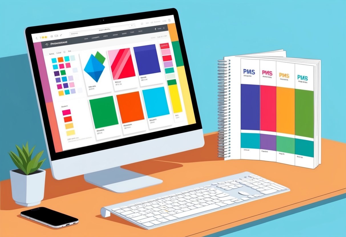
Pantone Connect is a key digital tool that integrates seamlessly into your design software. This platform gives you access to over 15,000 Pantone Colors, ensuring you have the perfect colors at your fingertips.
Connecting Pantone to tools like Adobe Illustrator or Photoshop lets you use the Pantone Matching System (PMS) for precise color selection.
You can build, share, and save your palettes directly in the software, assisting in maintaining a consistent design language. Using Pantone’s digital solutions ensures that your selected colors are true to the source, minimizing discrepancies between digital screens and printed materials.
Maintaining Color Consistency Online
When working in digital design, color consistency is vital. Here, Pantone provides a reliable standard that can be maintained across different devices and platforms.
By using Pantone Colors in digital formats like RGB and HEX codes, you can ensure that your colors look the same on all devices.
Pantone’s influence in digital design is critical for brand managers and graphic designers. It ensures that colors remain consistent whether you’re designing web graphics, apps, or digital marketing materials. Through precise color matching, Pantone helps maintain visual uniformity across various digital spaces, which can strengthen brand recognition and trust.
Frequently Asked Questions
When working with PMS colors, you might have questions about practical aspects like matching colors, understanding different systems, and using digital tools. Here are some common questions regarding PMS colors.
How can I match a color to a PMS color code?
To match a color, you can use PMS color swatches or a Pantone guide. These resources allow you to visually compare and select the right PMS color code, ensuring consistency in your designs.
Where can I find a PMS color chart for reference?
You can access PMS color charts online through the Pantone website or buy a physical Pantone guide. These charts provide a comprehensive set of color samples and their corresponding codes.
What is the process for converting HEX color codes to PMS?
Converting HEX to PMS typically involves using software tools or online converters. By entering the HEX code, these tools offer the closest PMS match, which can then be used in design projects.
What is the difference between CMYK and PMS color systems?
CMYK is a color model used in printing to create a wide range of colors by mixing Cyan, Magenta, Yellow, and Black. PMS is a color matching system that provides specific color codes to ensure color accuracy across various platforms.
How can I identify a specific Pantone color?
To identify a Pantone color, you’ll need a Pantone guide or an online tool. By matching your color sample to these resources, you can find the exact Pantone code quickly and efficiently.
How to find the PMS color of an object in Adobe Illustrator
To find a PMS color in Adobe Illustrator, select the object and open the “Swatches” panel. From there, you can use the “Recolor Artwork” feature to find and apply the closest PMS match from the Pantone libraries.