
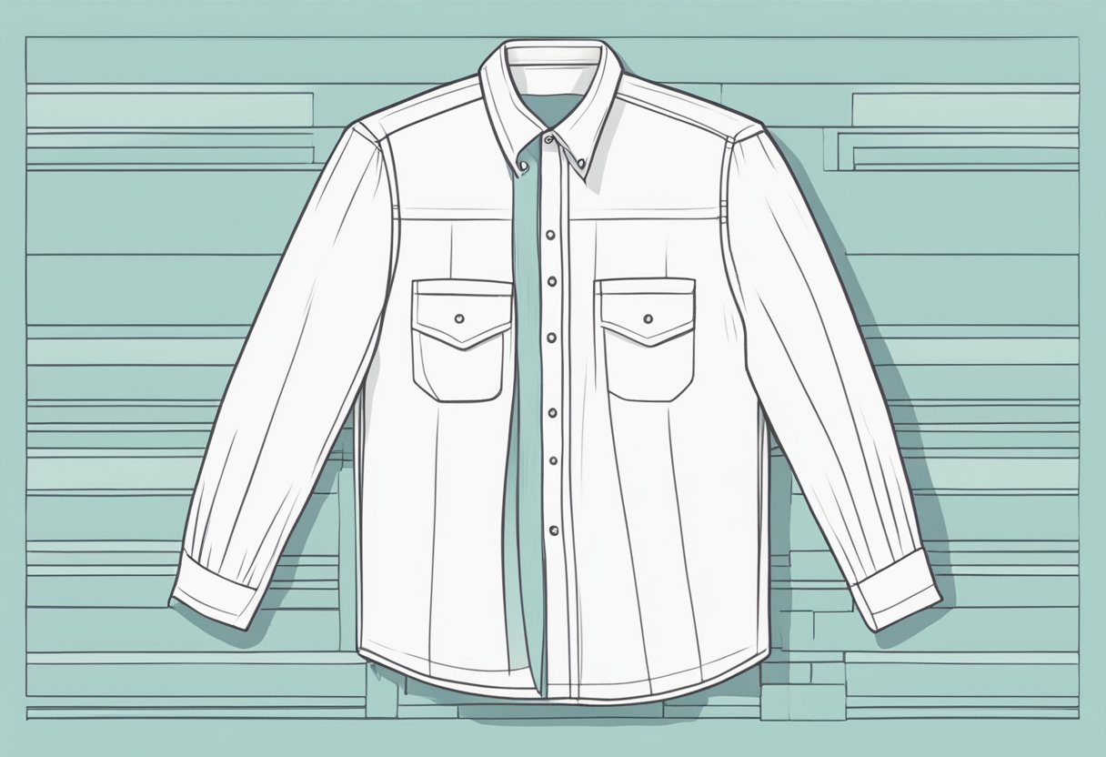
When designing a t-shirt, one of the most crucial decisions is the placement size of the name on the back of the shirt. This detail can make a significant difference in the shirt’s overall appearance and functionality. Whether it’s for sports teams, events, or personal use, getting the placement just right ensures that the name is visible and stylish.
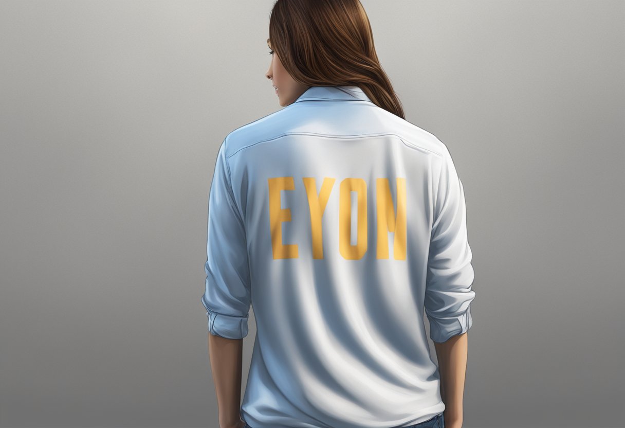
For adult t-shirts, it’s generally recommended that each letter is about2-2.5 inches in height, with the name spanning 8-12 inches across. This size allows the name to be seen clearly from a distance. For children’s shirts, you should adjust the size, making the letters around 1-1.5 inches in height to maintain balance and readability.
Placement is key to making the design look professional. A good starting point is to position the name about4-6 inches below the collar for adults. This creates enough space for the name to be centered and easily noticed. Always make sure to consider the overall design and other elements on the shirt to maintain harmony and visual appeal.
Understanding Shirt Placement Basics
When placing a name or logo on the back of a shirt, it’s key to follow design principles and recognizecommon placement areas to ensure a balanced and professional appearance.
Principles of Design Placement
Design placement starts with the basics of alignment, size, and spacing.
Logos or names should be centered horizontally to look balanced. Start the design 2-3 inches below the collar for a uniform appearance. This placement works well for most shirt sizes.
Standard sizes for text are often 2.5-5 inches wide and tall. For larger logos, aim for 6-12 inches wide. Keep the proportions appropriate to avoid looking awkward.
Little adjustments can be made for different shirt sizes or specific design requirements. For example, using a larger font or graphic may require starting a bit lower to maintain balance.
Overview of Placement Areas
Different areas have specific uses. The main ones are the upper back and full back.
Upper Back: Place the design 2-3 inches below the collar. This is great for names and small logos. Avoid putting it too close to the collar or too low near the middle of the back.
Full Back: For bigger designs that cover the full back, start 2-3 inches below the collar and extend it down the centerline. Ensure to maintain a vertical balance, ending no lower than mid-back.
Knowing these key areas and basic principles helps in achieving a professional and balanced look.
Anatomy of a Shirt for Placement
Understanding where toplace designs on a shirt is crucial for a balanced and professional look. The key areas to focus on are the front andback print zones, as well assleeve placements.
Front and Back Print Areas
The front of the shirt is typically divided into three main areas: left chest, center chest, and full front. Smaller designs, like logos, are often placed on the left chest, about 3 to 3.5 inches from the collar. For center chest placement, position the top of the design 1.5 to 3 inches below the collar. Full front prints should start around 2 to 4 inches below the collar and can cover a large area.
On the back of the shirt, theupper back is the common spot for names and numbers. Names are usually placed 2-3 inches below the collar. Below the name, you can add numbers, typically 2.5-3 inches below the name. This balanced approach ensures readability and a clean look.
Sleeve Placement Variations
Sleeve designs can add an extra layer of customization. You can place designs on either sleeve, providing a unique touch to the shirt. Smaller logos or text are usually placed a few inches from the shoulder seam. For right or leftsleeve designs, ensure the placement is uniform. This standardization keeps the look consistent and professional.
Remember, the size and type of design can impact where it should be placed. If you’re unsure, experimenting with mock-ups can help gauge the best placement for your specific needs.
Size and Proportion Considerations
When designing a name to be printed on the back of a shirt, it’s important to think about both the size and the placement of the print. This ensures a balanced and professional look, no matter the shirt size.
Establishing Print Size and Location
First, decide on the size of the letters. For an adult shirt, 2-inch (5 cm) high letters are a common choice. Smaller shirts might need smaller letters, like 1.5 inches (4 cm). Make sure the name is centered horizontally and positioned 2-3 inches (5-7.5 cm) below the collar.
Table of Suggested Letter Heights:
| Shirt Size | Letter Height |
| Small | 1.5 inches |
| Medium | 2 inches |
| Large | 2 inches |
| X-Large | 2.5 inches |
Placement Tips:
- Ensure the name is straight and centered.
- 2-3 inches below the collar for proper alignment.
Scaling Designs to Shirt Sizes
Adjust the design size based on the shirt’s size. For smaller shirts, reduce the print size to avoid overcrowding. For larger shirts, increase the size to ensure visibility. For example, if you start with an 8-inch (20 cm) width for a small shirt, increase it by 1 inch (2.5 cm) for each larger size.
Suggested Print Width by Shirt Size:
| Shirt Size | Print Width |
| X-Small | 7 inches |
| Small | 8 inches |
| Medium | 9 inches |
| Large | 10 inches |
Pay attention to the proportions so the design does not overwhelm the shirt or appear too small. Scaling properly ensures the name looks good and maintains readability across all sizes.
Specific Placement Guidelines
For achieving apolished and professional look on your shirts, it’s crucial to follow precise guidelines for placing names and designs. This ensures that your artwork stands out and fits well on various parts of the shirt.
Front Placement Guidelines
When positioning designs or logos on the front, the most common spots are the left chest and center chest. For theleft chest area, logos typically measure between 2.5″ to 5″ wide and tall, starting about 3 inches below the collar. This size ensures visibility without overwhelming the shirt’s layout.
Forcenter chest placement, you should aim for a size range of 6″ to 10″ wide by 6″ to 8″ tall. The top of the design usually sits 3 inches below the collar, creating a balanced look. When working with larger or full front designs, go for 10″ to 12″ wide by 10″ to 14″ tall to make a bold statement.
Back Placement Guidelines
For backing design placement, there are a couple of popular spots: upper back and full back. If you’re placing a name on the upper back, it generally sits about 3 inches below the neckline, with sizes ranging from 2.5” to 5” wide and tall. This size is ideal for creating a clear and visible label without overshadowing the shirt’s main design.
For full back designs, the dimensions should be around 10” to 12” wide and 10” to 14” tall. This ensures that your artwork, whether it’s a name or a larger design, is prominent and easily noticeable.
Sleeve Placement Guidelines
Sleeve logo placement is popular on long sleeves orshort sleeves with a sporty or promotional look. For consistency, a logo on the right or left sleeve should generally measure 2” to 4” wide and tall. The design is usually centered 2 inches away from the shoulder seam.
Whenplacing logos or text along the sleeve length, sizes can vary based on sleeve length and design elements. Ensure the text or logo maintains a consistent width of around 2” to 4” to avoid visual clutter.
These guidelines will help you achieve a well-balanced and appealing shirt design that stands out in style and function.
Technical Aspects of Placement
When placing a name on the back of a shirt, you must consider the type of printing method used and the fabric type. Proper placement ensures durability and looks professional oncustom apparel such as polo shirts,t-shirts, andsublimation shirts.
Screen Printing Techniques
Screen printing is a popular method for custom shirts due to its durability. For name placement on the back, align the design center vertically and horizontally.
- Use 3-4 inches below the collar for a balanced look.
- Letters should be between 2-3 inches tall.
- Use high-quality ink to ensure the print withstands washing.
Direct-to-Garment Printing Considerations
Direct-to-garment (DTG) printing is ideal for complex designs and small batches. This method requires careful alignment to prevent skewed designs.
- Position the name 2-3 inches below the collar.
- Keep text size within 2.5-5 inches wide.
- Ensure the fabric is smooth and pre-treated for better ink absorption.
Heat Transfer Vinyl Applications
Heat transfer vinyl (HTV) is versatile for personalizing shirts. Precise placement is crucial to avoid peeling.
- Place the name 3 inches below the neckline.
- Maintain a uniform size, usually 2-3 inches in height.
- Use a heat press machine at the recommended temperature for best adhesion.
Each method has specific considerations for achieving a well-placed, durable, and aesthetically pleasing name on the back of your shirt.
Artwork and Design Specifications
Effective placement size for names on the back of shirts requires attention to detail in image files and formats, as well asdesign composition and legibility. Below is a guide to help you get it right.
Image Files and Formats
To ensurehigh-quality prints, use the correct image file types and formats. PNG and JPG are the most common formats. PNGs are ideal for designs with transparent backgrounds. JPGs are suitable when transparency is not needed.
Images should be 300 DPI (dots per inch) for clear and sharp prints. Lower resolutions can result in blurry designs. Vector files (like SVG) are also excellent for scalability without losing quality.
Check the color profiles when creating your designs. Using RGB for digital displays and CMYK for printing ensures accurate color reproduction.
Design Composition and Legibility
Good design composition ensures that names are both visually appealing and easy to read. Position the name 2-3 inches below the collar for balance. Ideal font size varies, but 3-4 inches in height is common for readability.
Choose alegible font. Avoid overly decorative or script fonts that may be hard to read from a distance. Stick to bold, sans-serif fonts for clarity.
Keep the overall design within 10-12 inches wide to maintain proportion. Ensure the name size does not overshadow the shirt’s other elements by balancing the design’s primary and secondary features.
Practical Considerations for Placement
When placing a name on the back of a shirt, it’s important to consider the type of fabric and how different body types can affect the design placement.
Materials and Fabric Types
Different materials can change how the name appears on the shirt.Cotton, the most common fabric, is easy to print on but may shrink. Polyester resists shrinking but can be harder to print on, requiring special inks.
Blended fabrics, like cotton-polyester blends, offer a balance but may need test prints to ensure quality. Stretch fabrics, such as spandex or elastane, require the design to accommodate stretching to avoid distortion.
Before printing, check how the fabric behaves with differentprinting methods. Some materials work better with heat transfers, while others are more suited for screen printing. Evaluate fabric flexibility to ensure a smooth print with no cracking.
Sizing for Different Body Types
The size and placement of the name should vary with body size to ensure it is centered and clearly visible. For smaller shirts (XS or S), aim for a name width of around 7-8 inches. Mid-sized shirts (M or L) might use 9-10 inches width. Larger sizes (XL and above) often require names around 11-12 inches wide.
Placement is key to achieving a balanced appearance. Names are generally placed 2-4 inches from the collar. On larger shirts, the name may need to sit a bit lower to remain centered across the back.
Take into account that some individuals may have broader shoulders or a different torso length. Adjust placement to suit these variations, ensuring the design remains proportional and aesthetically pleasing for all sizes.
By carefully considering these factors, you’ll achieve a professional and visually appealing name placement on any shirt.
Advanced Placement Techniques

Exploring advanced placement techniques can help make your designs stand out. This includes mastering oversize designs and experimenting with innovative placement ideas.
Oversize and Seam-to-Seam Designs
Oversize designs can make a strong impact when placed on the back of a shirt. These designs often extend from seam to seam, covering a large portion of the fabric. Full back design placement is popular forsports jerseys and concert merchandise.
Seam-to-seam placement means your design spans from one side of the shirt all the way to the other. This technique requires precision to ensure the design aligns correctly on the fabric. Using this placement can create a bold and unified look.
Considerations for Oversize Designs:
- Material: Choose high-quality fabrics to avoid distortion.
- Printing Technique: Use techniques like screen printing for best results.
- Design Alignment: Ensure design elements match across seams.
Innovative Placement Ideas
Innovative placement ideas can give your shirts a unique look. Some ideas include center chest placement and adding designs to unexpected areas like sleeves or below the collar.
Center chest placement is a great way to draw attention directly to the design. This is often used for logos and text that you want prominently displayed.
You can also consider full front design placement for a bold and eye-catching effect. This covers the entire front of the shirt, perfect for intricate and detailed artwork.
Other Innovative Ideas:
- Overlapping Designs: Create designs that span both front and back.
- Layering: Add small elements around the main design to create a layered effect.
- Interactive Design: Use unique prints like glow-in-the-dark or reflective materials.
Using these techniques can help you create visually appealing and unique shirts that stand out.
Maintaining Quality and Consistency
Ensuring that the placement size of the name on the back of a shirt stays consistent and high-quality is crucial. This involves thorough quality control and maintaining uniformity across all orders.
Quality Control in Placement
Quality control starts with precise measurements. For adult shirts, names are typically around 2-2.5 inches in height and 8-12 inches wide. Use a reliable ruler or a placement guide to measure the distances precisely.
Inspect each shirt before printing, ensuring the name is positioned roughly 2-4 inches below the back collar. This makes it visible and centered. The lower back should remain free of design to prevent discomfort.
Verify that the design is straight and not tilted. A crooked design can ruin the professional look. Use templates or grids to check alignment quickly. Regularly calibrate your printing equipment to avoid size and placement drift over time.
Consistent Placement Across Orders
Consistency across multiple orders is vital for customer satisfaction. Always keep detailed records of your design placements, including distances from the back collar and edges.
Create and follow standard operating procedures (SOPs) for printing. SOPs should be detailed, covering the exact placement of names, equipment settings, and quality checks. This ensures every team member knows the standards.
For bulk orders, print a few test shirts to confirm placement before starting the entire batch. This helps catch any errors early and correct them.
Provide training for employees regularly. This keeps everyone updated on the best practices and standards, ensuring every shirt meets your quality requirements. Use feedback from customers to improve your processes continuously.
Frequently Asked Questions
Understanding the placement size of a name on the back of a shirt involves precise measurements. Here are answers to some common questions about this topic that will help you get it right.
What are the standard dimensions for a name printed on the back of a t-shirt?
The standard dimensions for a name on the back of a t-shirt are typically between2 to 3 inches in height and 8 to 12 inches in width. It’s important to adjust these sizes based on the shirt’s size and style to ensure it looks proportionate.
How do you determine the proper placement of a name on the back of a t-shirt?
To determine the proper placement, position the name about 2 to 3 inches below the collar. Ensure it is centered horizontally between the shoulder seams. This placement helps the name stand out and stay readable without looking awkward.
What is the recommended size for a number to accompany a name on the back of a sports shirt?
The recommended size for a number on a sports shirt ranges from 6 to 10 inches in height. The width should be proportional to the height. The number is usually placed below the name, allowing for a balanced and clear design.
What guidelines should be followed for vinyl lettering size when personalizing the back of a shirt?
Vinyl lettering should maintain a height of 2 to 3 inches for names. Ensure that the letters are clear and spaced evenly. The material and flexibility of vinyl allow for precise cuts, making it essential to follow these guidelines for a clean look.
How does the placement of a name differ between different sizes of shirts?
For smaller shirts, keep the name slightly smaller and closer to the collar, about 1 to 2 inches below. For larger shirts, increase the size of the name and the distance from the collar, ranging from 2.5 to 3 inches. Adjusting based on shirt size ensures the name appears properly proportioned.
What is the optimal distance from the collar for positioning a name on the back of a shirt?
The optimal distance from the collar for positioning a name is generally about 2 to 3 inches. This standard spacing works well for most shirt sizes and styles, providing a consistent and professional appearance.