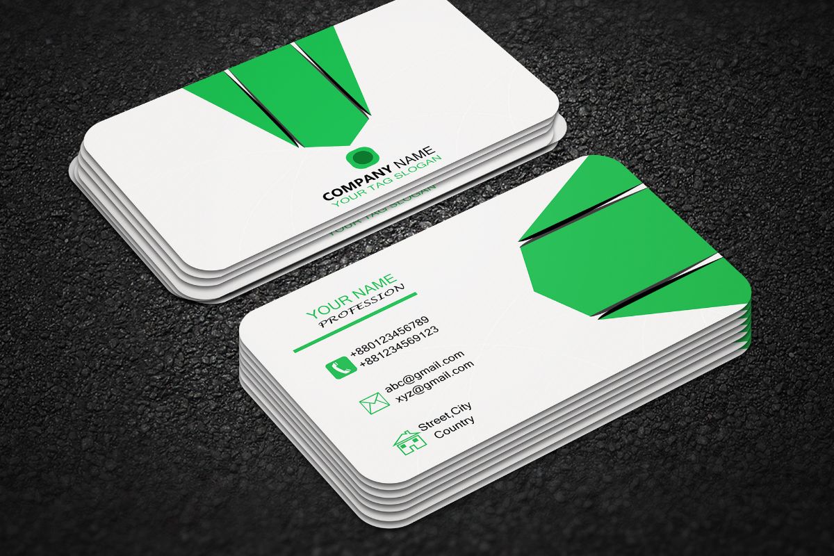
Designing a business card is a fundamental step in establishing your professional brand and fostering connections. When you hand someone your business card, you’re not just sharing contact information; you’re providing a snapshot of your brand identity. The design elements of your business card—color, typography, and imagery—need to align with your professional image and the messages you intend to convey.
Creating a compelling business card involves more than just listing your contact details. It’s about making a meaningful first impression that lingers long after that initial exchange. Whether you choose to use a tool like Canva’s business card maker, or decide to craft your design with Adobe Express, the principles remain the same: keep it professional, memorable, and reflective of your brand’s values.
It’s crucial to consider the tactile and visual aspects of your card. The texture, weight, and general feel can be just as impactful as the visual design itself. In an era where digital presence is significant, a well-designed business card can give you a competitive edge by reminding contacts of your physical presence in a digital world.
Purpose and Audience
When creating a business card, it’s critical to consider its purpose and audience. These factors will guide your design choices and ensure your card effectively represents you and your business.
Identifying Your Target Audience
Your business card should appeal to your specific target audience. To do this, first identify who they are. Are they corporate professionals, creative industry clients, or perhaps individuals in the technology sector? For example, if your audience is primarily designers, your card might showcase innovative design elements that would resonate with them. If you’re targeting bankers, a more traditional and conservative design might be more appropriate. Uncovering their preferences and expectations will lead to a design that connects with them. Design your card with your audience in mind.
Setting Your Business Card Goals
Setting clear goals for your business card is essential. Determine what you want your card to accomplish—should it drive people to your website, or is it more about solidifying a personal connection? Maybe your goal is to create a memorable brand experience. Your business card can serve multiple purposes:
- Branding tool
- Contact information reminder
- Direct marketing instrument
Tailor your card’s content and style to meet these goals, ensuring it carries the information and vibe that drive your objectives forward. Keep the information concise and focused; overcrowding your card can dilute its impact. Any more information and the card can become cluttered.
Design Elements

In designing a business card, the visual impact is paramount. Carefully consider your color scheme, typography, and the use of logos and graphics to create a memorable impression.
Choosing a Color Scheme
Your color scheme expresses your brand’s personality. Start with your brand colors to ensure consistency. If your brand lacks distinct colors, opt for a palette that conveys the mood of your business—use cool colors for a professional look or vibrant tones for a creative edge.
Selecting Typography
Typography must be legible and reflect your brand’s voice. Select a maximum of two fonts: one for headings and another for body text. Ensure your font choices are versatile across various platforms, from print to digital. Check out these examples of effective typography in business cards for inspiration.
Incorporating Logos and Graphics
Use high-quality versions of your logo to maintain a crisp appearance, particularly when scaled down. For graphics, choose elements that do not overwhelm; they should complement the text and not distract. Remember, less is often more, so consider the use of white space to give your design a clean and professional look.
Information to Include
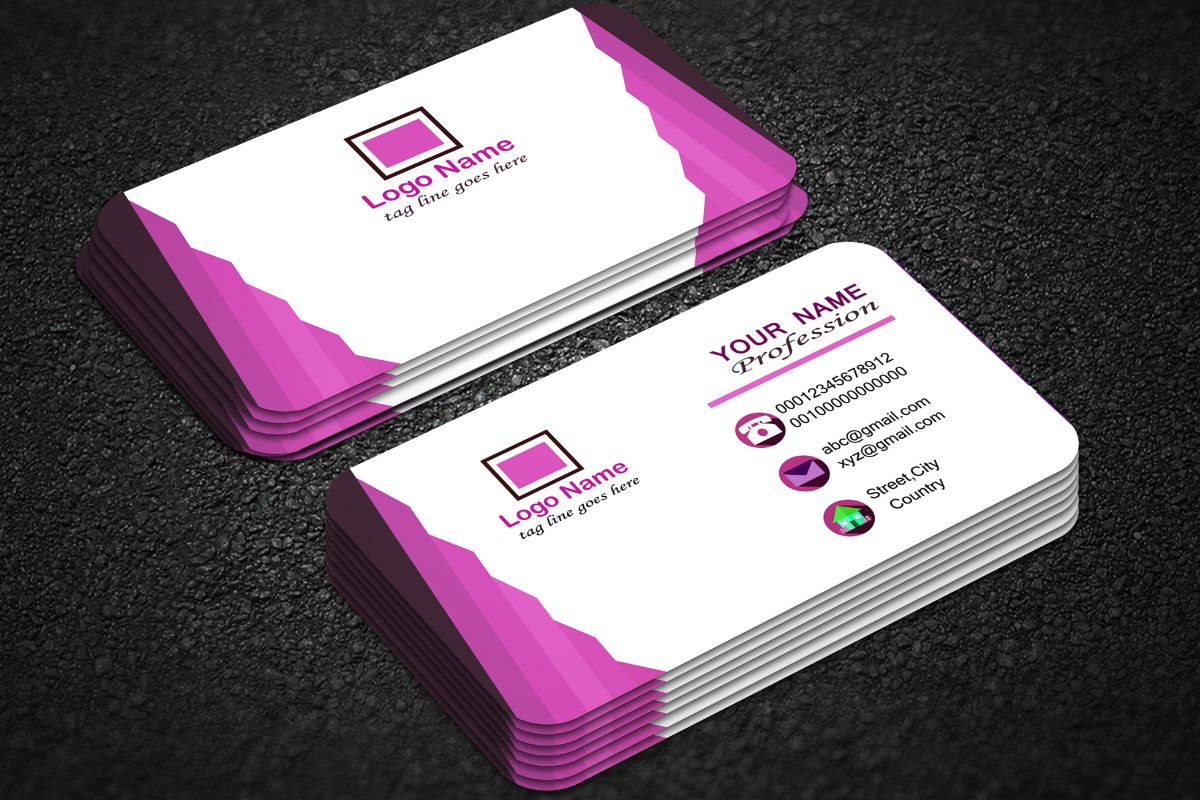
The business card is a tangible snapshot of your professional identity. It’s crucial to present the right mix of information clearly and concisely.
Essential Contact Details
Your business card is your professional connector, and it must list the means through which people can reach you. Ideally, this should cover:
- Company Name: The brand you represent.
- Your Name: Full name for recognition.
- Job Title: Clarifies your role.
- Phone Number: A direct line preferred.
- Email Address: Professional and current.
- Website URL: Directs to your business profile or portfolio. For example, if you have an online portfolio, you’d want to include the website, such as Design by Jane.
- Physical Address: If relevant, such as for a storefront.
- Social Media: Include only if it’s a professional account relevant to your business, such as a LinkedIn profile.
Professional Title and Affiliation
Your professional title and affiliation endorse your authority and connection within your industry. This information should be up-to-date and relevant:
- Professional Title: Clearly indicates what you do and your level of expertise.
- Affiliation: If you’re affiliated with any professional organizations, include the initials recognized within the industry.
Each element on your business card is a cue to your professional narrative, making accuracy and clarity non-negotiable. Your card should not only provide contact details but also reinforce your professional image.
Layout and Composition

When designing your business card, the overall layout and composition set the stage for presenting your information succinctly and attractively. Thoughtful placement and structuring of elements can make your card stand out.
Understanding White Space
White space, often referred to as negative space, is the unmarked area between design elements. Your use of white space can dramatically impact the card’s readability and perceived value. For instance, clustering all your elements together often overwhelms the reader. Instead, space out your contact information and logo to create a breathable, balanced layout.
Alignment and Balance
Proper alignment is key to creating a professional look. Align text boxes and design elements either centrally, to the left, or to the right to achieve visual continuity. Balance involves the distribution of visual weight. Symmetrical balance gives a formal look, while asymmetry can create dynamism. Ensuring your text and graphics are positioned with purpose, using bullet points or aligned columns, will enhance overall coherence.
Material and Printing
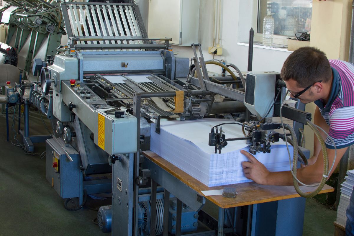
In this section, you’ll learn how the choice of material and the printing process are crucial for the outcome of your business cards.
Paper Quality and Texture
Paper quality directly impacts the perception of your business. For professional and durable business cards, cardstock weighting between 14 to 16 points is ideal. When considering texture, a matte finish lends a sophisticated look, while glossy finishes enhance color vibrancy. Textured paper like linen or laid adds a tactile element which can distinguish your card from others.
Printing Techniques
Various printing techniques can affect the look and feel of your business cards. Offset printing is standard for higher volume orders, ensuring consistent quality and color fidelity. Digital printing, on the other hand, is cost-effective for smaller quantities. For unique, high-end effects, consider letterpress or foil stamping which add depth and shine, respectively. Remember to check compatibility between your chosen paper and printing technique to ensure the best results.
Compliance and Branding

When designing your business card, it’s essential to ensure that you maintain brand consistency and adhere to legal requirements. These aspects will foster credibility and align with your brand’s identity and values.
Ensuring Brand Consistency
Your business card is a physical extension of your brand, so it’s crucial that the design aligns with your established brand guidelines. Utilize your official color palette and logo, and ensure that fonts and imagery are consistent with your brand’s other marketing materials. When selecting these elements, you might find the tips from Wix.com on staying on-brand particularly useful.
- Colors and Logos: Stick to your brand’s primary and secondary colors.
- Font Choice: Use the same font style as your official branding to support brand recognition.
- Imagery: Incorporate visuals that are used across your brand’s presence, whether online or in print.
Legal Considerations
Every business card must comply with specific legal regulations, which can vary depending on your industry and location. Be sure to include all mandatory disclaimers, certifications, or licenses that may apply to your profession. To avoid potential legal issues, review the business card’s content for accuracy. Relevant guidance can be found through resources like ZenBusiness regarding what essential information to include for a professional look.
- Contact Information: Double-check the accuracy of your phone number, email, and address.
- Disclaimers: If your industry requires it, include necessary legal disclaimers in a clear, but unobtrusive manner.
- Accreditations: Display any professional accreditations or licenses to reinforce your qualifications.
Prototyping and Feedback

Before sending your business card to print, you’ll need to go through the prototyping phase and gather feedback to ensure your design meets professional standards and communicates your brand effectively.
Creating Mockups
Create a realistic mockup of your business card. This visual prototype should include the actual dimensions, design elements, and text that you plan to use. It’s essential to examine your mockup on a screen and in print format, if possible, to check for legibility and overall impact.
Gathering Feedback
Once your mockup is ready, solicit specific and actionable feedback. Share your prototype with a diverse group of individuals, including those who understand branding as well as potential clients to cover a spectrum of perspectives. Ask targeted questions about design clarity, information hierarchy, and first impressions to gain insights that will refine your design. Remember to keep feedback organized in a list or table so you can address each point methodically.
Distribution Strategy
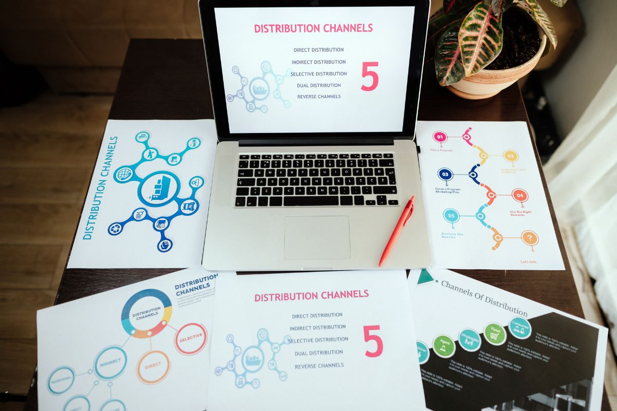
A strong distribution strategy maximizes your business card’s impact by ensuring it reaches the right people in the right way. Your strategy should align with your networking goals and incorporate both digital and physical distribution methods for a broad reach.
Digital and Physical Distribution
In today’s connected world, you have the opportunity to distribute business cards both physically and digitally. For physical cards, think quality over quantity; hand them out when a genuine connection is made. As for digital business cards, leverage the convenience by sharing via email or professional networking sites. They offer a versatile option by including multimedia, such as video or links, enhancing your professional image. To learn more about creating a powerful digital card, visit this guide on effective digital business cards.
Networking Opportunities
Attend trade shows and networking events relevant to your industry for the chance to meet potential clients and partners. When you engage in conversations, offer your card, but also be prepared to accept others’ cards with interest. Additionally, consider setting up a booth, if possible, to increase your visibility. For more detailed strategies on card distribution at events, explore ways to distribute business cards at wikiHow Life.
Frequently Asked Questions
When designing a business card, your primary goals are to convey your contact information effectively and to leave a lasting impression on the receiver. These FAQs will guide you through the essentials of creating a business card that stands out, from the initial design process to the final print.
What are the key principles to consider when creating a business card?
In business card design, you should prioritize clarity, color, consistency, and crispness. These principles ensure that the card is not only aesthetically pleasing but also communicates your details clearly and aligns with your brand identity.
Which software or tools are best suited for business card design?
Professional design software like Adobe Illustrator (AI), Photoshop (PSD), or InDesign (INDD) provide flexibility and control, allowing you to create layered, editable source files for your business cards. For those seeking free alternatives, tools like Canva can also be suitable.
What steps should be followed to ensure a professional business card layout?
To ensure a professional layout, start with a clear plan of your content, use a legible font, and leave ample white space for readability. Additionally, make sure your design is aligned with your brand and includes a call to action.
Can you suggest some tips for designing an effective business card template?
An effective business card template should balance the inclusion of essential details with a clean, uncluttered design. Select colors appropriate to your brand, maintain consistency in your design elements, and ensure your logo is prominently displayed for quick identification.
How can one include 3D elements in a business card design using online resources?
While traditional business cards are 2D, you can simulate a 3D effect through shadowing, embossing, or using online templates that allow for creative designs. Online printing services may offer custom cuts and finishes that add tactile elements to your card.
What are some common mistakes to avoid when printing your own business cards?
Avoid using low-resolution images that can become pixelated upon printing, and ensure all-important text is within the safe design area to prevent it from being cut off. Always double-check your proofs before final print to catch any errors in layout or content.

