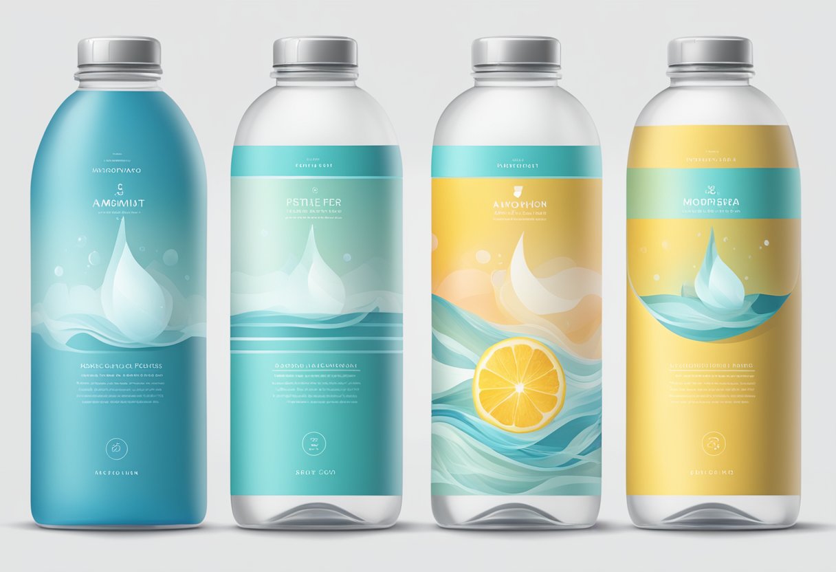
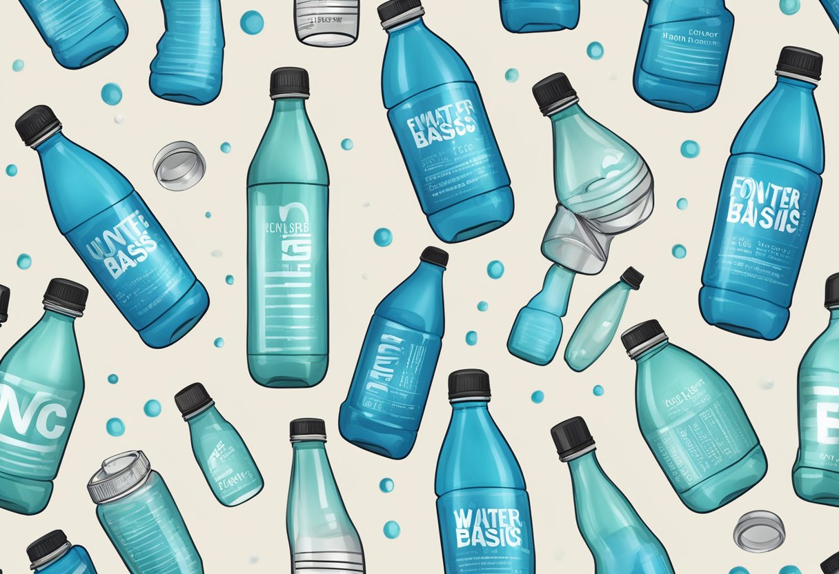
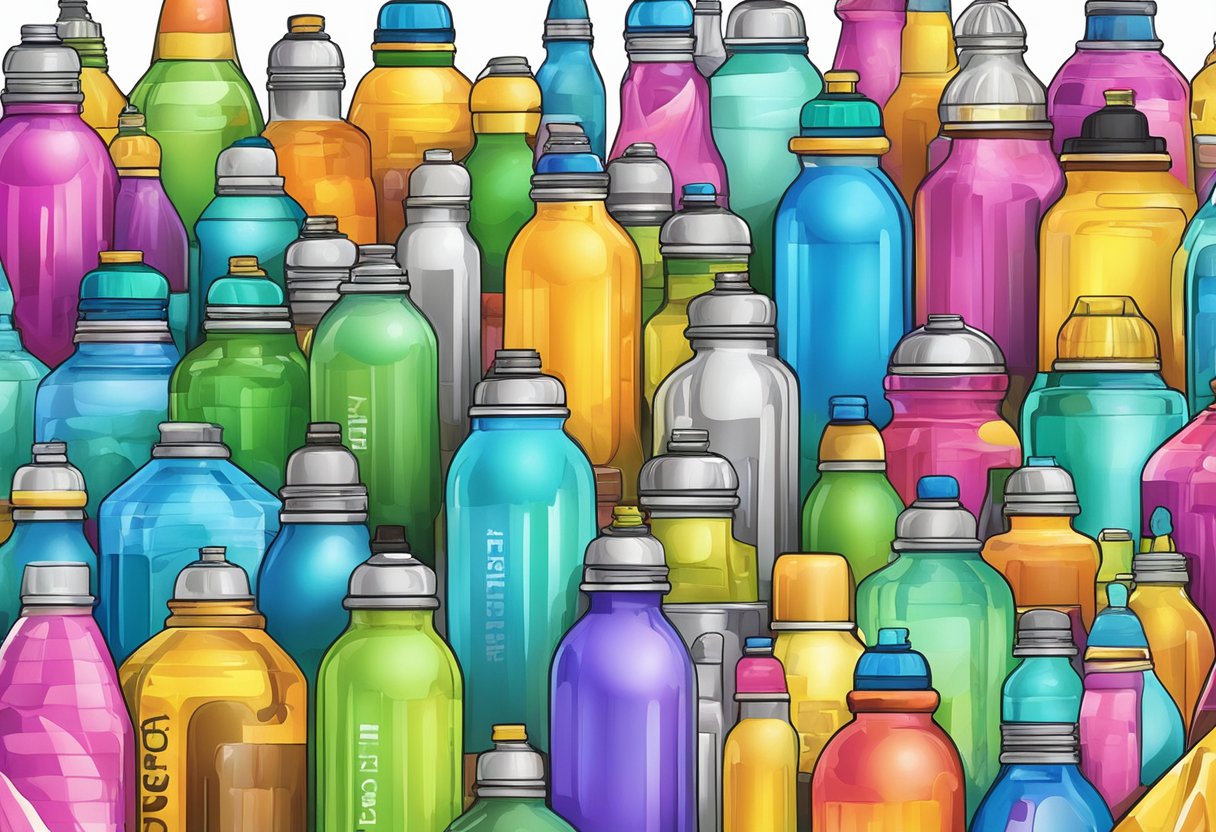
Choosing the right font for your water bottles can make a big difference in how they look and appeal to your audience. Whether you are creating personalized bottles for a sports event, branding them for your company, or simply making gifts for friends, the font you use is crucial. Thick and connected fonts are some of the best options because they adhere well to bottles and are easy to read. This kind of typography ensures your message stands out, making your water bottles not just functional, but also stylish and unique.
Fonts like Aisollya are a great choice for water bottles, especially if you’re using vinyl. These fonts often come with thick lines that stick well to curved surfaces like bottles and tumblers, making the application process smoother. Additionally, fonts that allow for layering add dimension and creativity to your design, giving extra flair to your bottles.
For promotional water bottles, it’s important to use fonts that are clear and readable at a glance. Marathon runners, students, and gym enthusiasts will appreciate bottles that are not only functional but also have an aesthetic appeal. Investing in the right typography can make your water bottles memorable and effective marketing tools.
Understanding Font Basics
When choosing fonts for your water bottles, it’s essential to understand the basic elements of typography and the different types of fonts available. You’ll also need to know about font licensing.
Typography 101
Typography is the art of arranging text in a readable and appealing way. This involves selecting the right typeface, adjusting the spacing, and aligning text properly.
The key elements of typography include:
- Kerning: The space between individual characters.
- Leading: The space between lines of text.
- Tracking: The overall spacing between characters in a block of text.
Proper typography ensures that your text is not just readable but also visually pleasing.
Font Types and Categories
Fonts come in various types and categories. The main types include:
- Serif Fonts: Have small lines or strokes at the ends of letters (e.g., Times New Roman). They are often used in print.
- Sans Serif Fonts: Do not have the extra lines at the ends of letters (e.g., Arial). They are good for digital screens.
- Cursive and Script Fonts: Imitate handwritten text or calligraphy (e.g., Pacifico). These are often used for decorative purposes.
- Display Fonts: Designed to grab attention with unique styles (e.g., Impact). They are suitable for short text blocks.
Each type has its own use case, so choose based on the purpose of your design.
Font Licensing: Commercial-Use vs Personal Use
When it comes to font licensing, it’s crucial to know whether you’re using the font for personal or commercial purposes.
- Personal Use: Allows you to use the font for personal projects, such as home crafts or non-commercial social media posts.
- Commercial-Use: Requires a license if you are using the font for anything intended for profit, such as promotional items or products for sale.
Always read the licenses carefully to avoid any legal issues. Some fonts come with both OTF (OpenType Font) and TTF (TrueType Font) formats, so make sure you download the correct version for your needs.
Design Principles for Water Bottle Fonts
Choosing the best fonts for water bottles requires balancing readability on curved surfaces, aligning with brand identity, and considering practical aspects of printing. Each principle directly affects how your text or logo appears, ensuring it looks good and adheres properly to the bottle.
Legibility on Curved Surfaces
Water bottles have a curved shape, making readability a crucial factor. Fonts with thick lines and simple designs work best. For instance, Gotham is well-suited because it is neither too thick nor too thin. Avoid overly decorative fonts as they can become hard to read on curved surfaces.
Using an offset can help. An offset creates a border around your text, making it stand out more. This method improves legibility and ensures that small pieces stick better.
Aesthetic Alignment with Brand Image
The font you choose should match your brand’s image. A modern brand might opt for sleek, sans-serif fonts like Gotham, while a brand with a classic image might favor serif fonts. For fun or youthful brands, playful fonts like Aisollya can add personality.
Consistency is key. The font on your water bottle should match other branded materials. This alignment reinforces your brand identity and makes it more recognizable. Always think about the overall look and feel that your font choice conveys.
Practical Considerations for Printing
Printing on curved surfaces requires attention to detail. Choose fonts that are easy to cut and adhere well to the bottle. Thick and connected fonts are often better, as they are less likely to peel off. Thick fonts like Arial Black or Impact are durable.
Also, consider the imprint area of the bottle. Your design should fit within this space without looking cramped. Using a bold font ensures that the text stands out even from a distance. Always do a test print to ensure the quality meets your standards.
Selecting the Perfect Font for Branding
Choosing the right font for your branding can have a direct impact on how people perceive your brand. It’s important to pick a font that fits your brand identity and helps in creating a memorable logo.
Creating a Memorable Logo
A memorable logo often relies on a well-chosen font. Fonts convey personality and mood. For example, fancy scripts might give a playful or classy vibe, while bold, sans-serif fonts can appear modern and strong.
Display fonts work well for logos because they are designed to attract attention. Think about how badges use distinctive fonts to stand out. It’s crucial to test your font choices in different sizes and contexts to ensure they look good and are readable.
Impact of Font Choice on Brand Recognition
The font you choose can significantly impact your brand recognition. Consistency is key. Using the same font across all your brand materials helps create a cohesive image. Simple, clean fonts are usually easier to read and more adaptable.
Consider the legibility of your font at different scales and mediums, such as on water bottles or promotional items. Fonts with unique characteristics can make your brand stand out, but they need to be clear and easy to read to be effective.
Top Fonts for Water Bottles
When choosing fonts for water bottles, it’s important to think about readability, style, and how the font fits the overall look you want. Here are some great options that will make your water bottle stand out.
Bold and Impactful Fonts
Bold fonts are eye-catching and easy to read from a distance. They are perfect for making a statement on your water bottle.
Impact: This font is thick and strong, making it ideal for short phrases or single words.
Bebas Neue: With its clean lines and uniform height, it provides a modern feel.
Helvetica Bold: A classic choice, it combines readability with a sleek look.
Elegant Script Fonts
Script fonts are perfect for adding a touch of elegance and flair to your water bottle design. They are often used for names or special messages.
Great Vibes: This font has flowing lines that look stylish and sophisticated.
Alex Brush: Known for its smooth curves, it’s both elegant and easy to read.
Pacifico: With its relaxed, cursive style, it adds a friendly feel to your design.
Playful and Fun Fonts
If you’re looking to create a playful and fun water bottle, these fonts will add energy and character to your design.
Comic Sans: Despite some mixed opinions, it’s easy to read and adds a whimsical touch.
Lobster: Its bouncy letters and playful style make it ideal for fun designs.
Grumbear: This font has a playful, cartoonish look that’s great for kids’ water bottles or anyone young at heart.
Modern Sans Serif Fonts
Modern sans serif fonts provide a clean and contemporary look. They are versatile and can fit almost any design style.
Montserrat: This font is sleek and modern, perfect for minimalist designs.
Open Sans: With its simple and clear lines, it ensures readability.
Raleway: It has a stylish, airy feel, making it an excellent choice for a modern look.
Choosing the right font can make your water bottle unique and personalized. Use these suggestions to find the perfect style for your needs.
Using Fonts Creatively
Using fonts creatively can make your water bottle designs stand out. By mixing fonts, adding flourishes, and choosing themed fonts, you can create eye-catching and unique bottles for any occasion.
Mixing Fonts for Dynamic Designs
Mixing fonts can add a dynamic look to your water bottle designs. Combining bold and thin fonts, or serif and sans-serif styles, creates contrast and visual interest. For example, pair a thick, bold font for a name with a script font for a quote. This contrast catches the eye and makes the text more engaging.
Ensure that the fonts complement each other. Avoid using too many fonts, as it can make the design look cluttered and confusing. Instead, stick to two or three fonts that work well together. Some good combinations include a retro font with a modern sans-serif, or a decorative font with a simple serif.
Adding Flourishes and Extras
Adding flourishes and decorative elements can enhance your water bottle designs. Swirls, borders, and icons can make the fonts more appealing and give a polished look. Flourishes can be added to script fonts to give them an elegant touch, suitable for wedding or party favors.
Borders and frames can help to highlight the text and make it stand out. Consider using small icons or illustrations that match the theme of your design, like beach or vintage themes. These extras can be placed around the text or used as dividers between different sections of text.
Fonts for Themed Water Bottles
Choosing the right fonts for themed water bottles can tie the whole design together. For kids’ bottles, look for cartoon or playful fonts that are easy to read and fun. For wedding or anniversary designs, elegant script fonts can add a touch of sophistication.
Party or event bottles benefit from bold, festive fonts that capture the spirit of the occasion. Beach-themed designs might use breezy, casual fonts to evoke a relaxed vibe. Retro or vintage fonts can give your bottles a nostalgic feel, perfect for themed events or promotions. Always match the font style to the theme to create a cohesive and attractive design.
Technical Aspects of Font Usage
When choosing fonts for water bottles, it’s essential to understand the technical aspects to ensure compatibility and optimal printing quality. The two most critical factors are font file types and adapting them for different printing methods.
Font Files and Compatibility
Fonts come in various file types, such as OTF (OpenType Font) and TTF (TrueType Font). Both formats are widely compatible with different systems, including Cricut, Procreate, and other design software. OpenType fonts often offer more advanced features, like additional ligatures and alternate characters, which can enhance your design.
Cricut machines typically support both OTF and TTF formats. Ensure your fonts are high-resolution to avoid pixelation during cutting. You can preview fonts within design software to see how they will look before committing to a design.
Optimizing for Various Printing Techniques
When printing on water bottles, consider thickness and style. Thick, connected fonts adhere better to curved surfaces, avoiding peeling and wear over time. Fonts such as Aisollya are ideal for this purpose. Conversely, overly thin fonts may not print clearly and can be susceptible to damage.
For digital designs on Procreate, adaptability across different devices and screen resolutions is vital. Maintaining font clarity ensures the final product matches your vision. Also, testing the design on multiple devices can help catch any compatibility issues early on.
Finding and Acquiring Fonts
When looking for fonts to use on water bottles, consider both the source of the fonts and how you’ll access them. Some fonts are free, while others require a purchase. Font marketplaces are excellent venues for finding both types.
Free vs Paid Font Sources
Free fonts are available from many resources, and they can be a great starting point. Sites like Google Fonts and Dafont offer wide selections. Free fonts are accessible without cost but may have limited usage rights.
Paid fonts often come from sites like Envato Elements and MyFonts. These usually offer more unique designs and extended usage rights. The price for paid fonts can vary widely, depending on the designer and the font’s features. When considering paid options, always check the licensing terms to ensure they meet your needs.
Utilizing Font Marketplaces and Libraries
Font marketplaces like Envato Elements and Creative Market provide a one-stop shop for diverse fonts. You can find new fonts and popular styles suited for water bottles. Marketplaces often have user reviews and previews, which help in making a choice.
Font libraries such as Adobe Fonts offer access through subscriptions and are integrated with design software like Adobe Illustrator. This allows for seamless design and application on your projects. Libraries ensure that you always have up-to-date font options at your fingertips, making it easier to stay current with design trends.
Font Customization and Creation
Creating personalized fonts for water bottles involves using handwriting styles and custom lettering. You can either choose pre-existing fonts or design your own to make unique designs that stand out.
Handwriting and Custom Lettering
Handwriting and custom lettering bring a personal touch. Fonts like those by Billy Argel and Typhoon Type can add a handwritten feel. This style makes your bottle look more authentic.
Choose a font that mimics natural handwriting. This adds a unique charm. Handcrafted fonts often include slight variations in each letter, making it look less mechanical. Fonts like those by Suthi Srisopha are excellent choices. They offer scripts that look handmade and lettered by hand.
Handwritten fonts can be both casual and elegant. They work well for names, quotes, and casual messages. Always test the font at different sizes. This ensures readability when printed on bottles.
Designing Your Own Font
Designing your own font gives you full creative control. Start by sketching your letters on paper. This helps in visualizing the final look. Use software like Adobe Illustrator or FontForge to digitize the sketches. These tools let you refine the shapes and adjust spacing.
Consistent stroke width and style are important. This makes the font look professional. Pay attention to each letter’s height and width. This ensures uniformity across the font.
Creating a custom font also allows you to add unique details. You can include special characters or symbols that represent a theme or personal touch. Font creation can take time, but the result is a unique, tailor-made design perfect for water bottles.
Frequently Asked Questions
When choosing fonts for water bottles, it’s important to consider readability, durability, and style. Below, you’ll find answers to common questions about selecting the best fonts for water bottle designs.
What types of fonts offer good readability on water bottles?
For good readability, use fonts with clear and distinct characters. Sans-serif fonts like Arial and Helvetica are easy to read. Script fonts can also work if they are not too intricate.
Which fonts are best suited for vinyl cutting, such as for use with a Cricut machine on water bottles?
Fonts that are bold and thick are best for vinyl cutting. Clarkson and Lemon Milk are excellent choices. These fonts cut well and adhere nicely to glass and plastic surfaces.
What are the most popular free fonts for personalizing water bottles and tumblers?
Popular free fonts include Lobster, Pacifico, and Roboto. These fonts are widely used in crafting communities for their versatility and style. You can find them on font websites like Google Fonts.
What font styles are recommended for creating water-themed text designs?
For water-themed designs, wavy or flowing script fonts can enhance the theme. Try using fonts like Pacifico or Brush Script. They add a fluid and dynamic feel to your text.
Can you suggest durable font choices that can withstand frequent washing on reusable water bottles?
Choose thick, bold fonts that remain readable even after multiple washes. Fonts like Impact or Bebas Neue are durable and maintain their shape over time.
What are the trending fonts for professional branding on water bottles?
Trending fonts for professional branding include sleek and modern options like Montserrat and Gotham. These fonts offer a clean and contemporary look, making them popular in corporate settings.